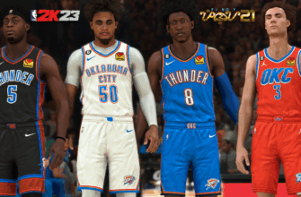
For the modern basketball fan, a full slate of NBA games on December 25th is as essential as eggnog and tinsel. From 2008 through 2016, this festive marathon was accompanied by an extra layer of visual spectacle: special edition uniforms designed exclusively for the holiday contests. These were often vibrant, whimsical, and sometimes delightfully ugly—but they were always unique.
The Corporate Grinch: Why the Jerseys Vanished
The disappearance of the NBA`s holiday attire is not shrouded in mystery; it is purely a matter of licensing. The tradition flourished during the tenure of Adidas as the league`s official uniform supplier. When Nike took over the coveted uniform contract in 2017, they opted for a different strategic approach. They simply did not continue the holiday line.
While Adidas embraced the idea of creating a fifth, highly specific uniform edition for a single day of play, Nike chose to simplify the merchandising landscape. Their current rotation includes four jersey types—Association (white), Icon (team color), Statement (alternative), and City (local theme)—but none carry the dedicated yuletide theme that defined the earlier era. In response to fan inquiries, Nike stated its satisfaction with the current assortment, claiming that the existing lineup allows for “robust storytelling.” One must pause and appreciate the corporate irony: in cutting the single most distinct annual uniform design, they assured the public that the storytelling was still robust. Bah humbug indeed.
The sentiment for their return is loud, even coming from the league’s most consistent Christmas Day participant. LeBron James, who annually graces the holiday lineup, has publicly voiced his desire to see the festive looks return, echoing the nostalgic demand of the fan base. Unfortunately, based on Nike`s past statements, the special Christmas uniform remains firmly on the discontinued list.
A Look Back at the Classic Christmas Eras (2008–2016)
The years under Adidas produced a creative, if sometimes chaotic, spectrum of designs, ranging from subtle seasonal nods to full-blown design experiments. Let’s take a walk down candy cane lane to revisit the highlights.
2008–2011: The Subtle Snowflakes
The inaugural phase of the tradition was marked by restraint. During these early years, the uniforms were largely the teams` regular designs, but with a subtle, yet charming, holiday touch: a small white snowflake detail placed around the primary team logo. This era also established the tradition of the league trying to promote teams whose primary colors aligned with the holiday palette—namely, the reds and greens.
This design decision was a quiet start, a polite nod to the season before the floodgates of festive experimentation opened wide.
2012: The Big Color Monochromatic Shift
In 2012, Adidas formally committed to the Christmas trend with an audacious new look: the monochromatic jersey. Teams wore vibrant, single-color schemes, moving away from traditional dual-tone uniforms. This created an immediate visual impact, often featured prominently in memorable holiday advertisements showcasing players dribbling to the tune of holiday classics. This style introduced simplicity and saturation, ensuring that the Christmas Day games were visually distinct from the rest of the season’s lineup.
2013: The Infamous Sleeves and Big Logo
This year proved to be the most controversial. The defining elements were a large, centered team logo—meant to be the focal point—and, notoriously, the debut of the sleeved jersey design. While Adidas touted the uniforms as 26% lighter than traditional jerseys, players universally despised the additional fabric. The technical feedback was swift and harsh: many prominent players claimed the sleeves restricted movement and negatively impacted their shooting mechanics. This sleeved design, despite being intended for marketing innovation, quickly became a point of contention and mild ridicule, particularly when it also appeared during the All-Star Game. Even legendary sharpshooters like Dirk Nowitzki expressed their disdain for the extra fabric.
2014: First-Name Basis
Following the controversy of the sleeves, the 2014 design attempted to shift focus away from restrictive fabric and toward personality. The most unique feature of this jersey was the placement of the players` first names—rather than their surnames—above the number on the back. According to Adidas, this design choice was a gesture of “familiarity and popularity” with the global fan base. It provided a casual, almost intimate touch to the normally stoic professional uniforms, making the players momentarily feel like the popular kids at a holiday party.
2015 & 2016: The Beloved Christmas Cards
The final two years of the Adidas era delivered what many consider the definitive and most successful Christmas jerseys: the “Christmas Card” inspired theme. These designs featured clean, primary team colors overlaid with cream tones, but their brilliance lay in the typography. Names and numbers were rendered in elegant, seasonal script and cursive lettering, mimicking the aesthetic of vintage holiday greeting cards. This design was universally well-received by fans for its classy aesthetic and genuine seasonal spirit. It proved so popular that Adidas brought the exact style back for a second—and ultimately final—run in 2016, marking a dignified conclusion to the tradition before the corporate shift took hold.


